Journal

[ movement piece one ]

This year I am studying for a postgrad Diploma in Dance at Trinity Laban in Greenwich. The course includes many hours of practical dance classes a week (which I am loving), including ballet and contemporary, as well as some theoretical studies which I am really excited about applying to my work. One of the modules is Site & Performance, which focuses on creating work specifically for a given location. Last week we were asked to create a movement event inspired by the idea of lines and film it at home. Here is my piece.

[ orchid flower - 2022 colour of the year ]

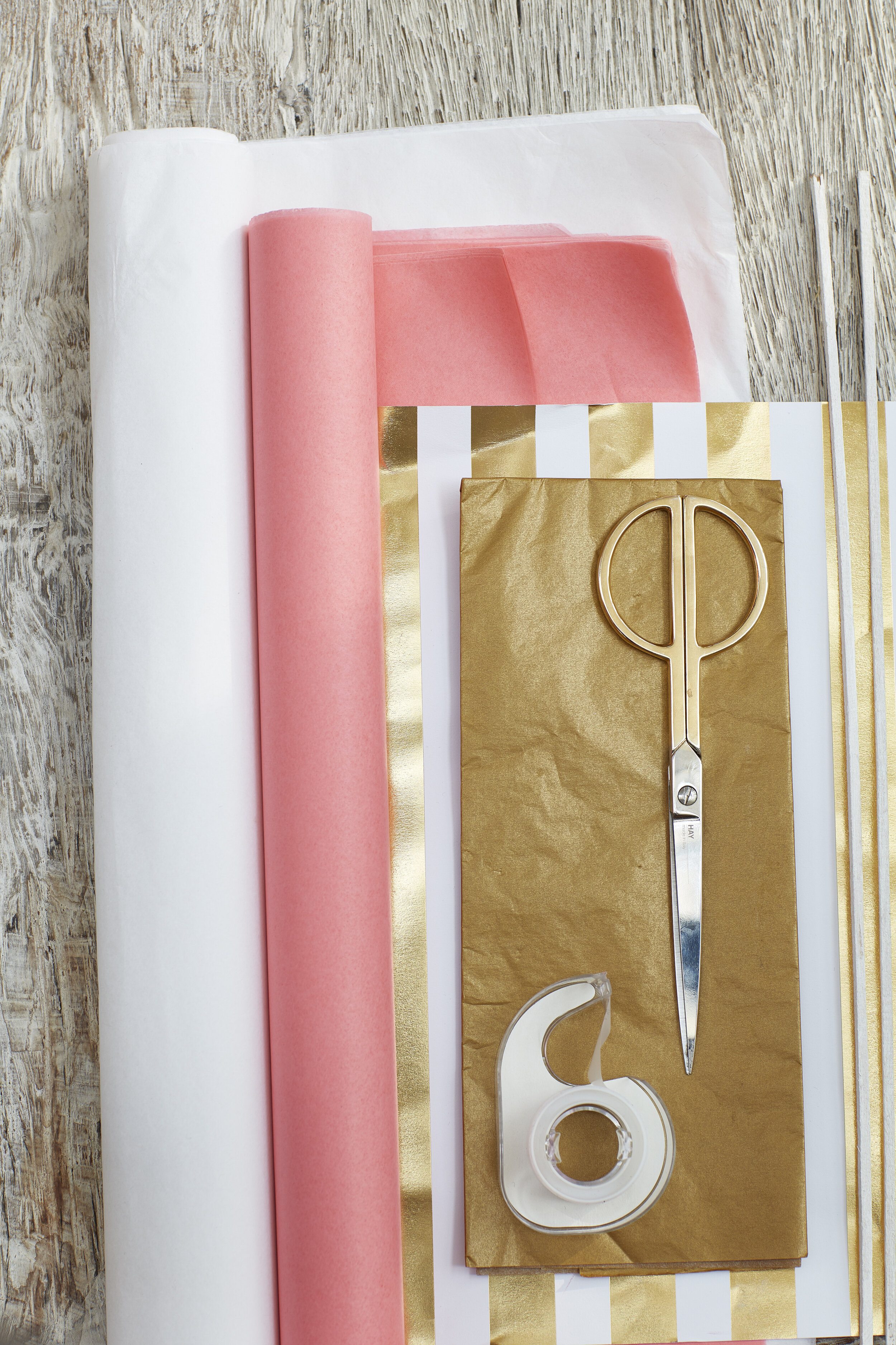
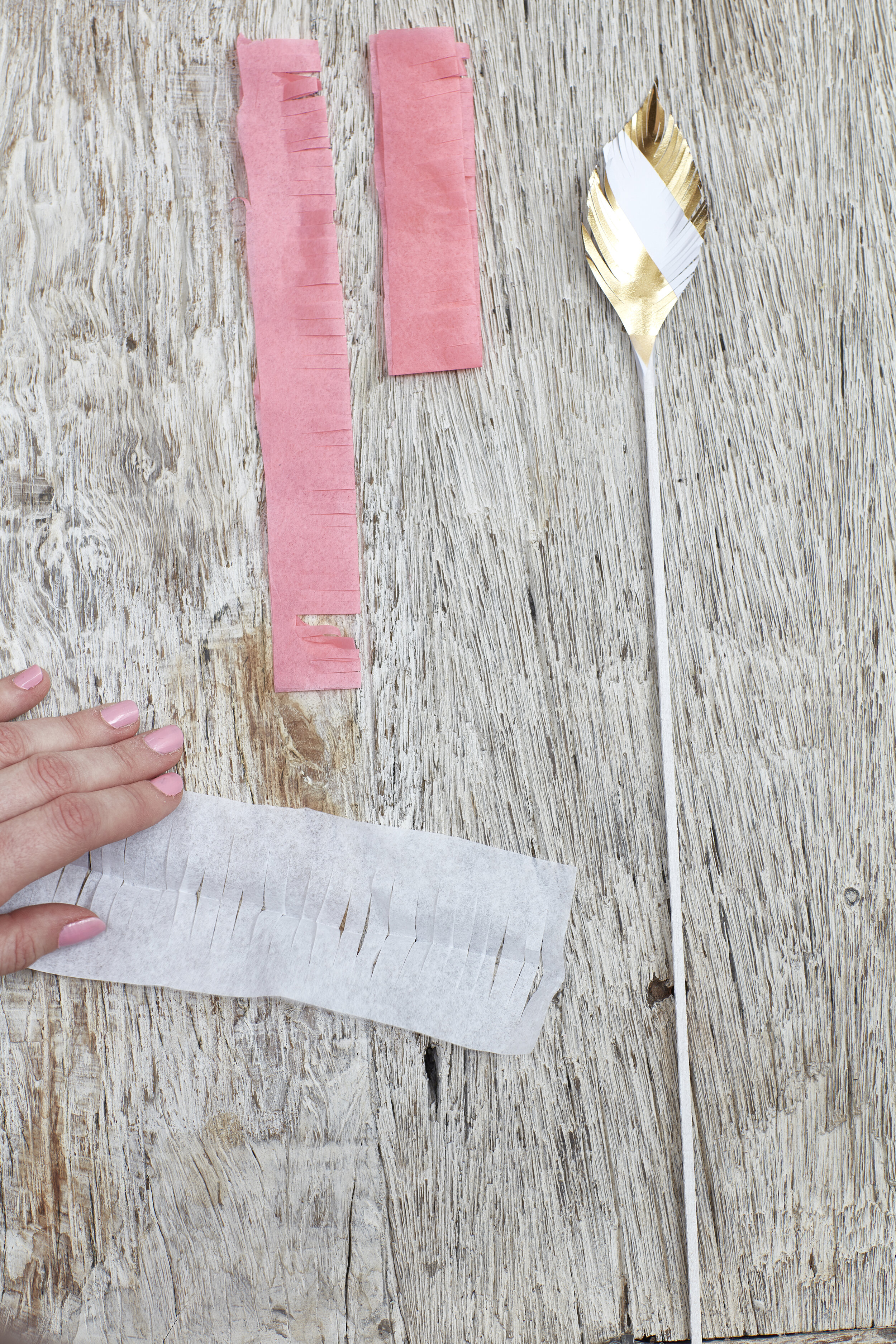
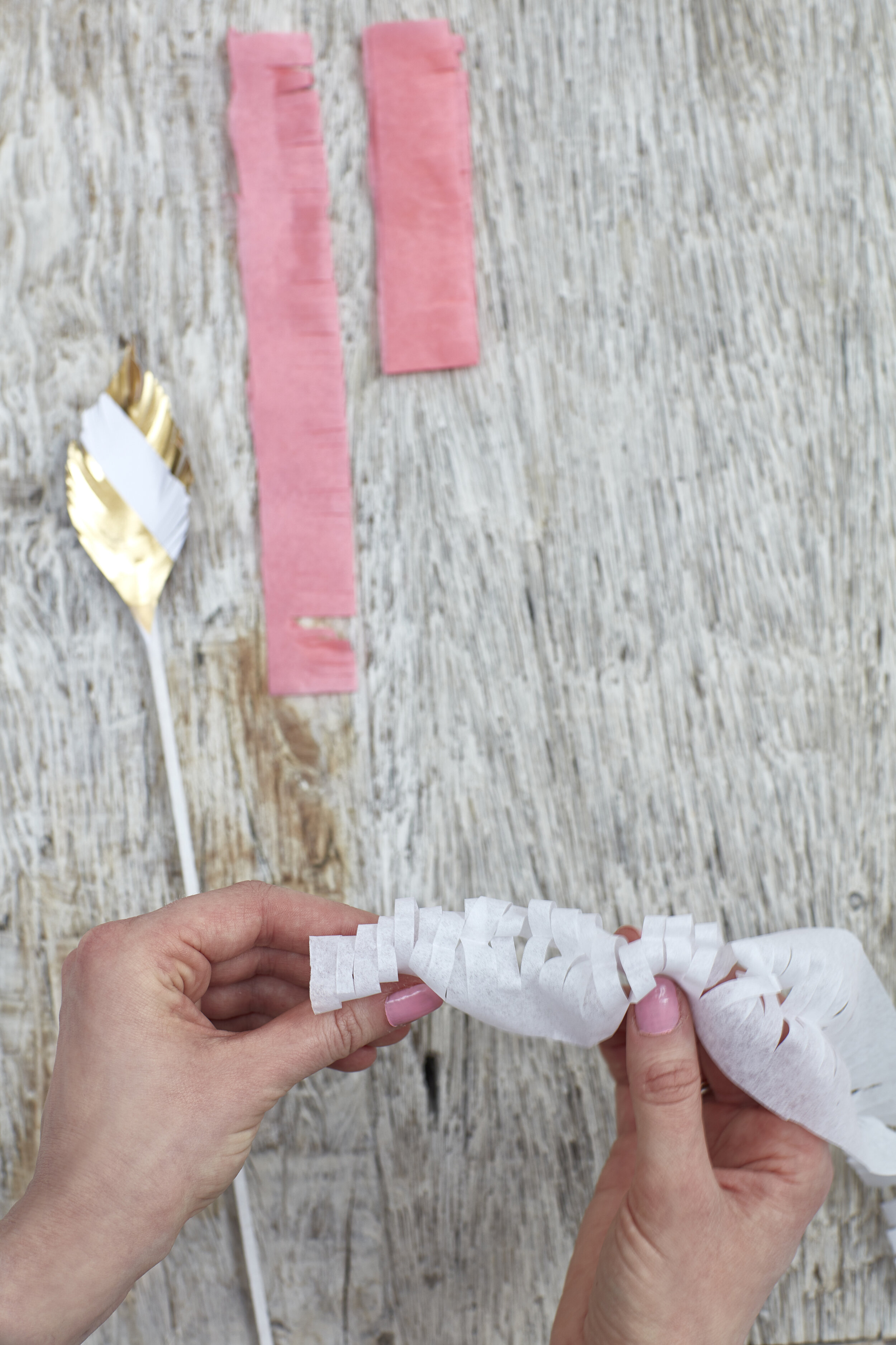
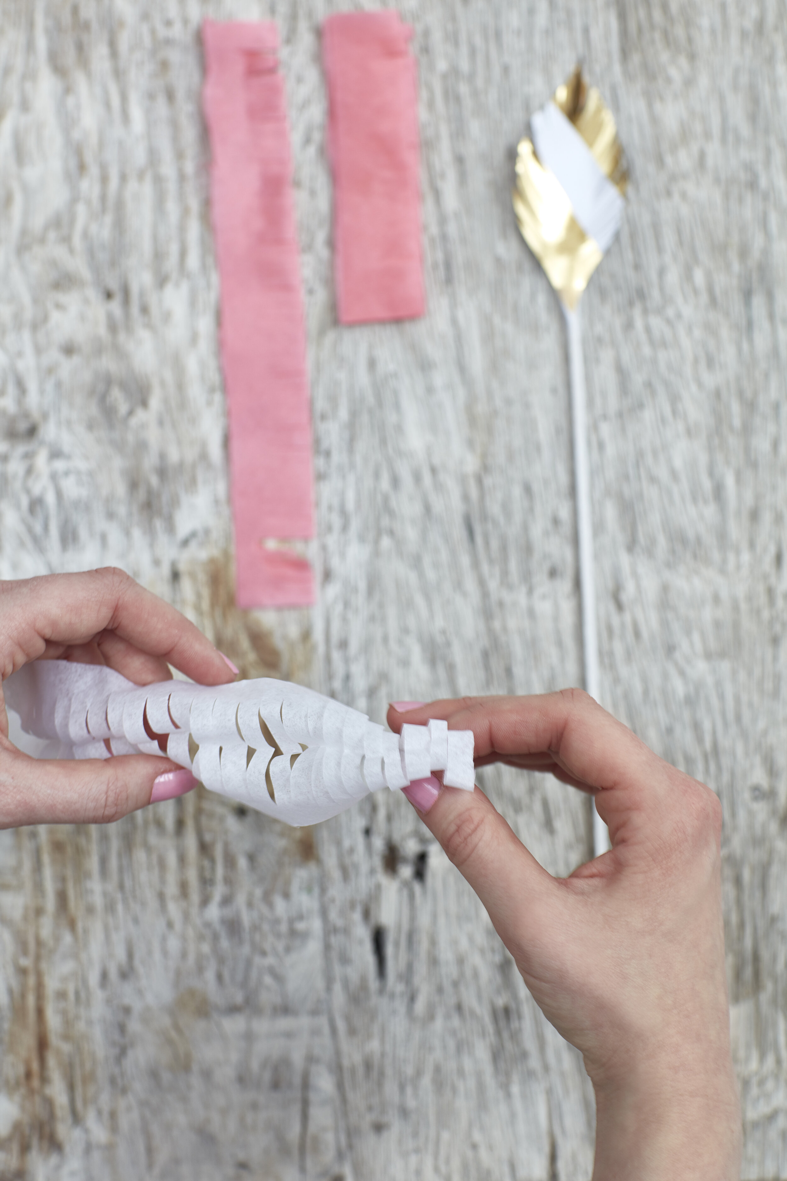
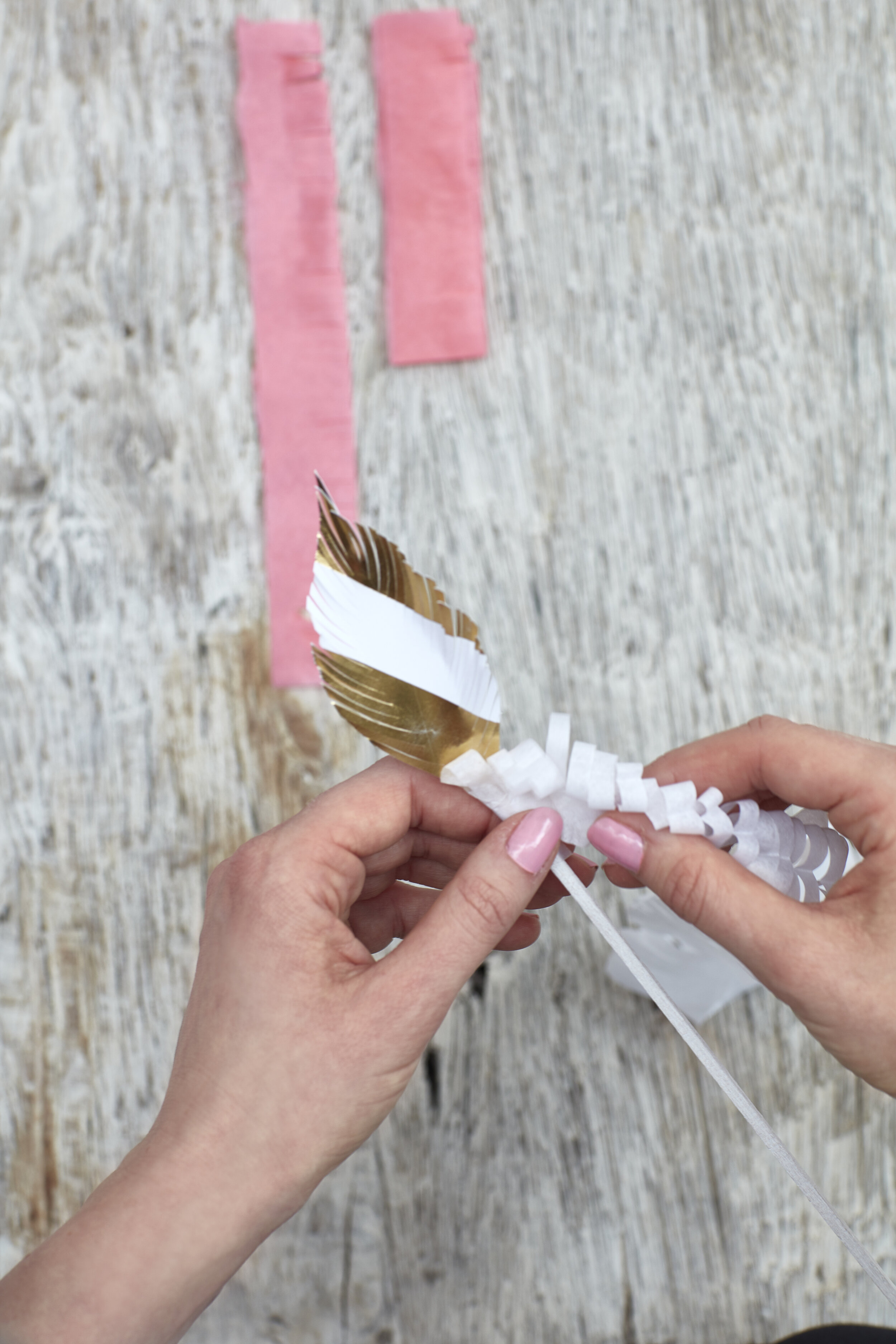
Right about now we need some lightness in our world. “We all need beautiful colour surrounding us, even if we don’t know it, to lift our spirits and feel positive.” says award winning artist Morag Myerscough. Step in WGSN and Coloro, who recently announced their key colours for 2022. Of the five announced, Orchid Flower came out as the colour of the year. They describe it as “hyper-real” and having “an energising quality”. Morag agrees saying, “As soon as you see it, it draws you to it, so vivid it almost seems artificial.” Whilst we will see its use predominantly in young women’s fashion, the trend forecasters also see it transferring into menswear, because of its purple undertones, as well as in small ways in interiors such as accent pieces or in prints (scroll down for tips on how to make it work for you).

Joanne Thomas, head of content at Coloro, said in a statement. “[Orchid Flower] is versatile enough to work across seasons and continents. In a challenging time, this saturated magenta tone will be a great way to create a sense of positivity and escapism.” This ties in with Ingrid Fetell Lee’s findings on the power of colour to spark joy, which we all know is exactly what we need right now. She says ““Bright color adorns festivals around the world, and it almost seems as if the more intense the colors the more intense the joy.”

The first three images are from WGSN & Coloro’s announcement.  The last two are from un-credited sources on Pinterest.

The first three images are from WGSN & Coloro’s announcement. The last two are from un-credited sources on Pinterest.

So pink doesn’t seem to be going anywhere just yet, although Orchid Flower is much more intense than the pinks we’ve seen a lot of in recent years. I look forward to introducing it as a highlight in styling and playing with complimenting it with textures and other tones.

Here’s how I see Orchid Flower evolving as a highlight colour. Paired with midnight skies and urban greys, clashed with provocative animal prints and grown up florals. Picked out as a flash of colour in a more muted overall pallet. I love this look and see that I already have elements at play in my own home and wardrobe.

Footwear Design Consultant, Cleo Reid tells us to expect to see “the vibrancy of this colour in simple silhouettes using rich suedes and luscious satin.” She describes the colour as lending itself to Spring/Summer, but that we will see darker hues being introduced into Fall/Winter (which I’m particularly looking forward to).

Cleo Reid provides examples of footwear trends that we can expect to see using Orchid Flower in 2022.Key Trends : Simple sandals, using fine stripping, a big emphasis on shape and silhouette, the heel being the main focus.

Cleo Reid provides examples of footwear trends that we can expect to see using Orchid Flower in 2022.

Key Trends : Simple sandals, using fine stripping, a big emphasis on shape and silhouette, the heel being the main focus.

I've already been drawn to taking my pinks back a few notches by styling them with dark tones (you'll notice a bit of a change on my grid) and Orchid Flower will need that more than any other. So although these bright tones will play an important part in uplifting our mood as we come out of this global pandemic, we will also see colours given more maturity and sophistication through styling, texture and tonality. Where pink had become synonymous with millennials, I see pink taking back its place in the pallet of stylish, grown up and sophisticated colours.

[palemki workshop ]

We’re at the end of Week I of Corona Virus self isolation and today I hosted a Palemki making workshop from my living room to around 70 people across the world. It was organised with my dance group Orleta and Ognisko, a Polish club in West London, as an opportunity to stay connected with our respective communities as well as keeping us occupied at this weird and difficult time.


Palemki are a traditional Polish Folk decoration made for Palm Sunday (which happens to be next week). They are made as offerings to take to church. We used to make them as Polish girl scouts here in London and then sell them to raise funds!

If you missed the online workshop you can re-watch it on the dance group’s Facebook page!

91Magazine.21.3.160107.jpg

[ p a l e m k i … ]

… are a traditional Polish Folk decoration made for Palm Sunday (which happens to be next week). Palemki would be made as offerings to take to church. We used to make them as Polish girl scouts here in London and then sell them to raise funds.

If you missed the online workshop you can re-watch it on the dance group’s Facebook page!


A few years ago I photographed some palemki and a step by step guide on how to make them with Malcolm Menzies for 91 Magazine. I thought it would be useful to repost them here to follow up from the online workshop. Send me any pictures of your creations and I’ll share on my Instagram! Lx


[ idris elba - "sexiest man alive" ]

I was lucky enough to be on set with the Idris Elba for People magazine US. This year Idris has been voted Sexiest Man Alive 2018, and People magazine organised a shoot in London to capture the man himself. Take a look at these pages. Shot by the fabulous David Burton.

SMA.jpg
Idris-1.jpg
Idris-2.jpg
Idris-3.jpg
Idris-4.jpg
Idris-5.jpg
Idris-6.jpg
Idris-7.jpg

You’re welcome. Lx

[ fashion jewellery event ]

Last week I had the privilege of again working with the fabulous team at Facets PR.  

This time I was designing and styling a press evening for the incredible team at Lyon & Turnbull.

Lyon & Turnbull are an auction house who are holding their first Jewellery auction on the 15th November.

The brief was that Facets wanted to engage the fashion media with the work that Lyon & Turnbull are doing and help them put the word out about the accessibility and beauty of the pieces up for auction.

001_Lyon_Turnbull_PressEvent.jpg

The Connaught Street showroom is naturally divided into 3 spaces, which gave me the idea to create 3 distinct fashion trends that the collection could fit into.  I wanted to give it the feel of a studio space, an atelier.  So we created walls of tears and textures as you would find in a designer's studio.


The first room was the Opulence room!

006_Lyon_Turnbull_PressEvent.jpg

Facets created trend stories, giving dictionary definitions of all of the titles.

Anna Hayman lent us beautiful wallpapers, prints, lampshade and fabric.

The Place lent us stunning kimonos.

All of these details helped give the room that real rich Gucci sense of more is more.

012_Lyon_Turnbull_PressEvent.jpg
008_Lyon_Turnbull_PressEvent.jpg
013_Lyon_Turnbull_PressEvent.jpg
Just look at these stunning pieces of jewellery!!!

Just look at these stunning pieces of jewellery!!!

033_Lyon_Turnbull_PressEvent.jpg

The second room represented the minimalism trend.  Lots of black and white and marble.

I used poetry cards on the wall hung from metal lines.

I used poetry cards on the wall hung from metal lines.

089_Lyon_Turnbull_PressEvent.jpg
046_Lyon_Turnbull_PressEvent.jpg

The final room housed our Romantics trend.  Lots of flowers and florals.  Just look at all of those stunning chinese vases!  All coming up for auction with Lyon & Turnbull.

106_Lyon_Turnbull_PressEvent.jpg
098_Lyon_Turnbull_PressEvent.jpg
101_Lyon_Turnbull_PressEvent.jpg

and of course I have to share my favourite items of jewellery, they are....

ROMANTICS

ROMANTICS

MINIMALISM

MINIMALISM

OPULENCE

OPULENCE


A good night had by all...

A good night had by all...

[ flights of fancy ]

Cuckoo clocks and branches...

About a year ago I was walking home from a day at the studio and found a box of discarded cuckoo clocks.  I have always been on the look out for a cuckoo clock that I could paint up and hang on my wall.  I had visions of single colour blocking the ornate clock to give it a modern twist.

Soon this idea evolved into a concept perfect for a jewellery shoot!  I ran it passed my friends in the know over at Facets PR and they thought it was a great idea too.

So I got in touch with Deborah Castles over at Hello Fashion Monthly and asked if I could come in and pitch a concept to her.  She too loved and it and soon it had been commissioned for the Jewellery special issue in November.  One page become three, three became a double page spread and two singles.

50-54_JEWLLERY SPECIAL PDF DPS.jpg

The idea behind the concept is pretty self explanatory, but I loved the idea that the cuckoo had gathered delicious jewellery from the nearby tree and was flying them home to adorn her house.  The nearby tree was in fact a branch that my assistant Joy found in the park and spent a day lovingly preparing and painting.  It looks so effective doesn't it?

50-54_JEWLLERY SPECIAL Branch.jpg
50-54_JEWLLERY SPECIAL blackbird.jpg

We used these beautiful birds from a wall clock by Cox & Cox.  I loved the movement they created.  The papers we used for the back drops were from Farrow & Ball and Cole & Son.

Circling Swallows Clock

Circling Swallows Clock

Creating this shoot for Hello Fashion Monthly meant that we could call in extraordinary jewellery from the likes of Dior, De Beers, Chaumet, Lily Gabriella, which just helped make it look absolutely stunning.

Photography by Todd Sutherland

And here it is in print...  It is always such a treat to hold your shoot in your hands...

cover insta.jpg
opener insta.jpg
blackbird insta.jpg
green insta.jpg

[ new branding ]

My new branding...

In 2015 I decided that it was time for a make over and that I couldn't do that on my own.  It was after a period of excessive Pinterest use that I realised that I was inadvertently falling in love with the work of one very talented woman.  I looked her up and got in touch, and to my delight she agreed to work with me on my rebrand.

Here are just a few of her creations that I fell in love with.

Here are just a few of her creations that I fell in love with.

Corina Nika, brand name Cocorrina, is a beautiful person, full of positivity and inspirational messages.  She lives in Kefalonia living the life we Londoners dream of.  Just take a look at her instagram feed for ideas on where you should be going on holiday next or even emigrating to! 

I mean, just look!  And this isn't the half of it.  Corina's whole feed is luscious blues of the sea and the sky.  She might not know it yet, but I'm going to come visit her one day...

I mean, just look!  And this isn't the half of it.  Corina's whole feed is luscious blues of the sea and the sky.  She might not know it yet, but I'm going to come visit her one day...

Once I'd finished drooling over her photography, work and lifestyle.... we set out to work.  Corina gave me a questionnaire to fill in to get to know me a bit better and what might work for me.  She asked about my work and how I got into it.  She asked about my brand and my branding preferences.  But what I loved particularly is that she also asked me questions such as; If I were an animal what would I be...  Here are my answers to her questions.

If I were an animal I would be... A Heron”
”If I were a colour I would be... Blush Pink”
”If I were a word I would be... Tea”
”I used to... get stressed, now I do work that I love”
”I would rather live close to... My Family & Friends”
”Watching the sunset I think... What an amazing day. Thank you. Here’s to tomorrow!

Next up Corina asked me to put together a moodboard of what inspired me.  This was great fun.  I used a combination of random images and some branding that resonated with me.


From there Corina put together a brand identity design.  This contained colour pallet and key words.  I cannot begin to tell you how luxurious and pampering this whole experience felt.  I was receiving a pack from Corina with CLIENT : Laura Sawyer written on the front.  Me!  I was the client...  Just lovely.  The words that she was using to describe the brand and therefore my style did wonders for my confidence and understanding of my own style and styling personality.


What stands out in the Laura Sawyer brand, is the essence of fashion, humour, space and a little bit of wittiness.
The general brand style, would feel airy, modern, feminine and fun. Number #3 on the moodboard, shows a little bit of fun and wittiness in the design.

One we'd both agreed on the themes of the branding; colour, personality, feel.  Corina set out to come up with my new logo.  A big influence here was my handwriting which is quite identifiable, and I was really keen to make use of Corina's handlettering skills.

The English language is such a funny one isn't it?  I remember learning this phrase when I was learning to type and I could never get an emotional connection with it.  Of course I understand that it's only purpose is to have all the letter…

The English language is such a funny one isn't it?  I remember learning this phrase when I was learning to type and I could never get an emotional connection with it.  Of course I understand that it's only purpose is to have all the letters of the alphabet in it, and isn't there to trigger emotion... but still, I'd have liked it better if it had a flower in there or two...

From here she created my lovely new Laura Sawyer lettering, THE DETAIL and went on to start creating my secondary logo, which you can see at the bottom of the page.  Lastly she went away and created me two bespoke graphics for me to use in my branding.  Here's the finished project.  I am so proud of it, and absolutely loved working with Corina.  I hope that our paths cross again very soon.  Meanwhile... keep one eye open, I might just be tapping you on the shoulder in Kefalonia some time soon...!

Designed by Cocorrina Corina Nica

Designed by Cocorrina Corina Nica